Two column layouts on the web break down when one column is much longer than the other. Scroll far enough and some significant portion of the screen is empty.
One solution is to have each column independently scroll but multiple scroll bars can be very confusing for a user. A better solution is the one employed on Yahoo News where the shorter right panel is floating relative to the left but still scrolls with the primary browser scroll.
The Concept
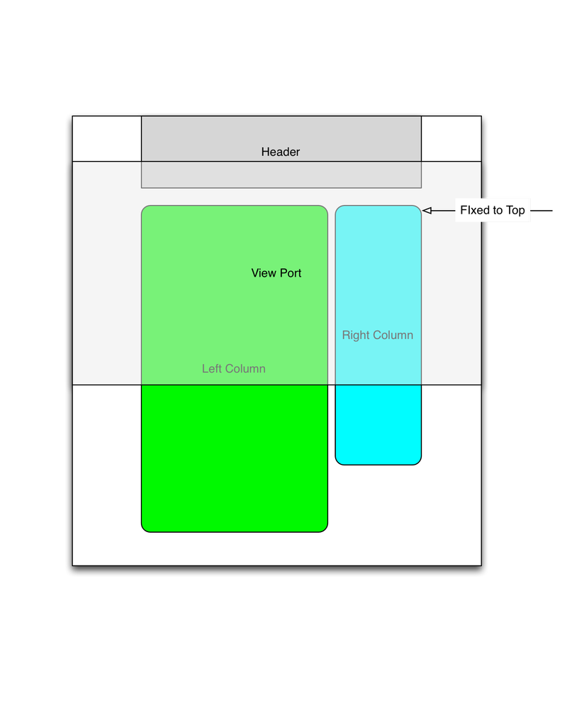
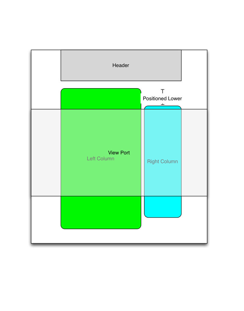
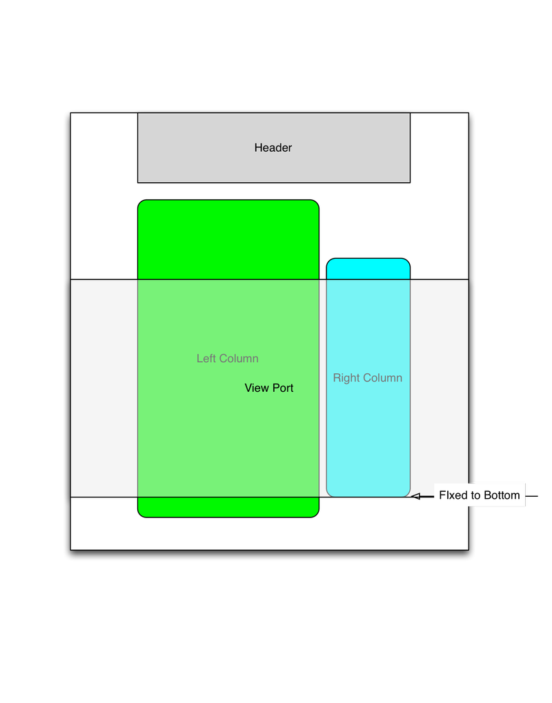
There are three situations to consider: the user is at the top of the content, the user is in the middle of the content, the user is at the bottom. The approach is pretty simple, if the viewport is at the top or bottom of the content, fix the right panel to the correct border. If the contents of the right panel are in the middle of the viewport, then add enough top margin to keep the content within view and adjust accordingly on scroll.

At the top, position it where it started
When the browser viewport is at the top of the screen, the element should be position as it would be naturally.

As the user scrolls, adjust the top offset to keep in view
As the user scrolls, the element should be pushed down relative to it’s container so that no portion of the right column is empty.

At the bottom, fix it to the bottom of the viewport
Once the viewport reaches the bottom of the screen, the right column should be fixed in position. If the user starts scrolling up, then the column should remain in place until the top leaves from view.
Not pictured, but much easier, is the case where the right column is shorter than the viewport. Then the right column simply needs to be position fixed to the top of the screen once the header elements leave the viewport.
Demo
I’ve created a simple demo to show the implementation. You can see that it only scrolls once past the header and only the default browser scroll is used.
The implementation
To implement this solution, I created two JQuery Plugins, one to equalize the containers and the other to set up the scrolling panel.
Along with the plugin code, you’ll need jquery, JQuery Transit, and the two plugins supplied here.
    <script src="http://ajax.googleapis.com/ajax/libs/jquery/1.10.2/jquery.min.js"></script>
    <script type="text/javascript" src="../js/vendor/jquery.transit.js"></script>
    <script type="text/javascript" src="../js/jquery.equalSizeColumn.js"></script>
    <script type="text/javascript" src="../js/jquery.floatingRightColumn.js"></script>
There are three required divs. The container for the left column, the container for the right column and the floating element.
The containers must have a CSS position property set. The right column and the floating element must have an explicit height set.
    <style type="text/css">
    body {
        width: 960px;
        margin: 20px auto;
    }

    #leftColumn {
        width: 700px;
        padding-right: 20px;
        float: left;
        position: relative;
    }

    #rightColumn {
        width: 240px;
        float: left;
        position: relative;
    }

    #floatingColumn {
        width: 240px;
    }
    </style>
Finally, you need to make the left and right column containers equal size and construct the sliding panel.
    <script type="text/javascript">
    $(function() {
        $('#leftColumn').equalSizeColumn($('#rightColumn'));
        $('#floatingColumn').floatingRightColumn({
            leftColumnContainer: $("#leftColumn"),
            rightColumnContainer: $("#rightColumn"),
            bottomOffset: 20,
            topOffset: 0
        });
    });
    </script>
FAQ
Q: The right panel does not scroll
A: Make sure that the container for the left column and the container that the scrolling right panel are of equal size.
Q: The panel does not align correctly to the top and/or bottom
A: This does not account well for padding or fixed elements. You should set the top and bottom offset properties.
Q: Scroll works fine, but the panel gets very wide
A: The panel needs to be of fixed width. Otherwise the positioning tricks will expand the width to all available space.
Did you like this content?
Related Posts:
The (Almost) Universality of the $onInit Lifecycle Callback in AngularJS
AngularJS 1.x's Component functionality brought with it new lifecycle callbacks that are not restricted to controllers within Components.
One of my Favorite Design "Hacks"
The Mac Finder staying open is a great design "hack." It completely eliminates a complicated problem leading to a better overall experience.
Creating Rich Lists with lists.js
ListJs offers a clean interface and simple API for managing lists in html
